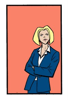


The premise is that a customer comes to a service rep with a problem, and the rep works with her to solve the problem. There were a lot more illustrations, but these are the highlights. Why the phone and envelope? Well, I liked the way they turned out, and they're only being used as icons roughly about half an inch in size, so I thought I'd post 'em at a decent size, just so someone will see the work! =)
I'll probably post again in a week or so. Busy times!
Best,
Rich


2 comments:
some really nice pics, rich!
i know--don'tcha hate it when you put so much into something only to have it reduced to barely recognizable size? or clipped or trimmed or flipped or...
get your paws off my work, you damned dirty editors!
anyway, thanks for sharing and know you're not alone.
smell ya later--
todd
Thanks, Todd!
Truth to tell, the drawings were designed to be icon sized, and it was my choice to draw the phone and envelope larger. I can't blame it on the client, who is actually terrific to work with. I just thought it would be easier for me to draw them at a size I could easily visualize. Then I realized that nobody would ever see the details.
Good thing I have this blog! =)
Thanks for stopping by and commenting!
Best,
Rich
Post a Comment